
HOA & Condo Website Examples: Real Community Websites Built By PropertyPop
Real Communities. Real Websites. Built by PropertyPop.
Every website featured below was designed and built by PropertyPop for a real HOA or condo association — these are live, active community websites, not concepts or mockups. We pulled screenshots from a cross-section of our client communities, from oceanfront condos in Florida to mountain communities in Colorado. Each example highlights a different aspect of our approach to community website design—from intuitive resident navigation and secure portals to communication tools, document organization, and community branding.
– A well-designed community website isn’t just about looking good — it’s about residents finding what they need in seconds, not minutes.
Last updated: August 19, 2026 · Added new Condo and HOA website design examples and expanded our website evaluation guide.
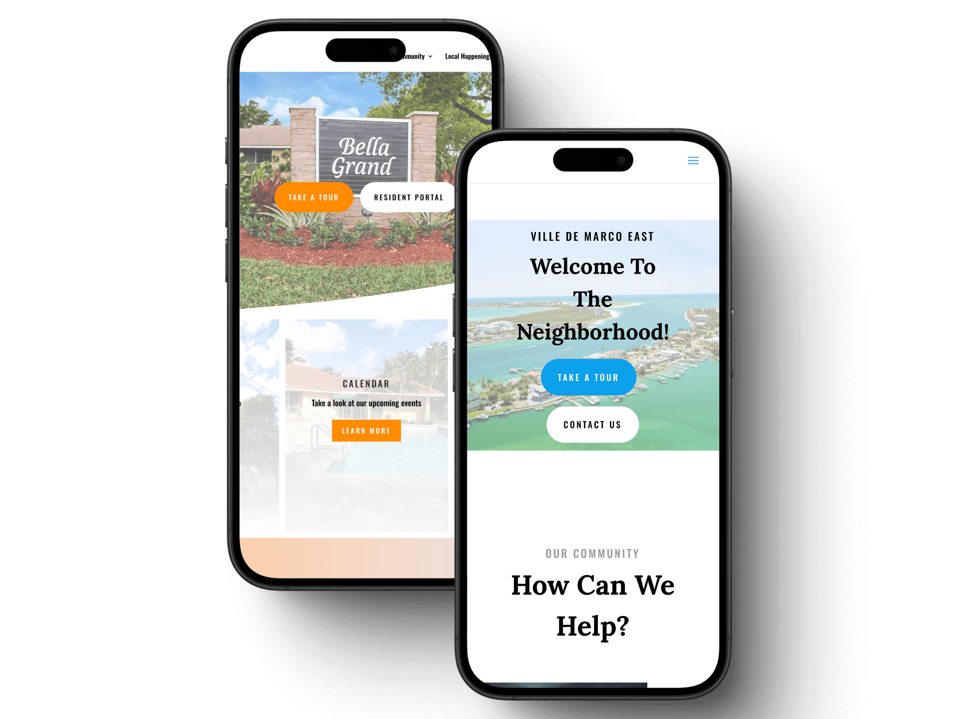
What Makes a Community Website Actually Work
Building HOA and Condo websites for nearly a decade has taught us that the difference between a website residents actually use and one they avoid usually comes down to a handful of decisions: where the login and resident portal sit, how documents are organized so people can actually find them, whether the site works as well on a phone as a desktop, and how clearly the homepage points visitors toward what they need most — event calendars, meeting notices, or contact information. As you look through the examples below, we’ve called out some of those specific design decisions and why they are make-or-break with your residents.
These aren’t presented as generic design inspiration—they demonstrate how different Associations use their websites to solve real communication and resident-access challenges.
Emerald Grande East Condo Website – Destin, Florida
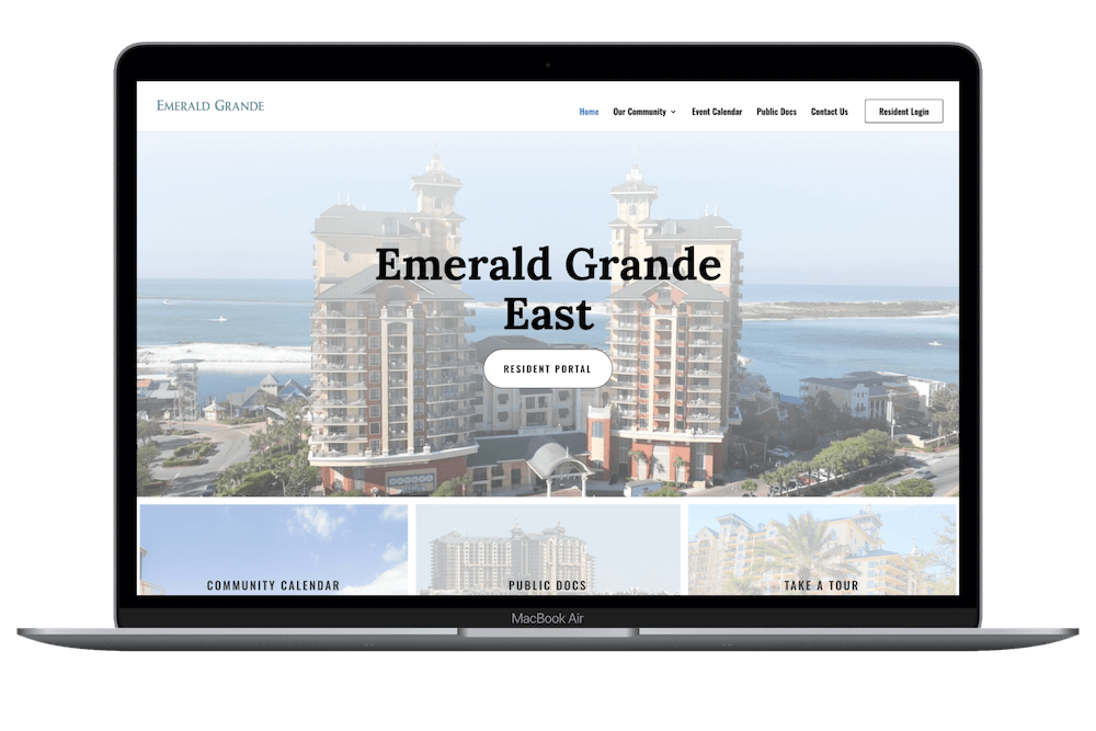
Resident-Focused Homepage Navigation
We designed the Emerald Grande East website around one of the most important principles of effective condo association website design: residents should be able to find the information they need immediately. The resident login is prominently positioned alongside timely community information such as announcements and upcoming Board meetings, while frequently used resources like the community calendar, public documents, and contact information remain easy to access. For a condominium association, this type of intuitive navigation helps turn the website into a practical day-to-day resource rather than simply an online brochure.
West Bay Gardens Association Website – Miami, Florida
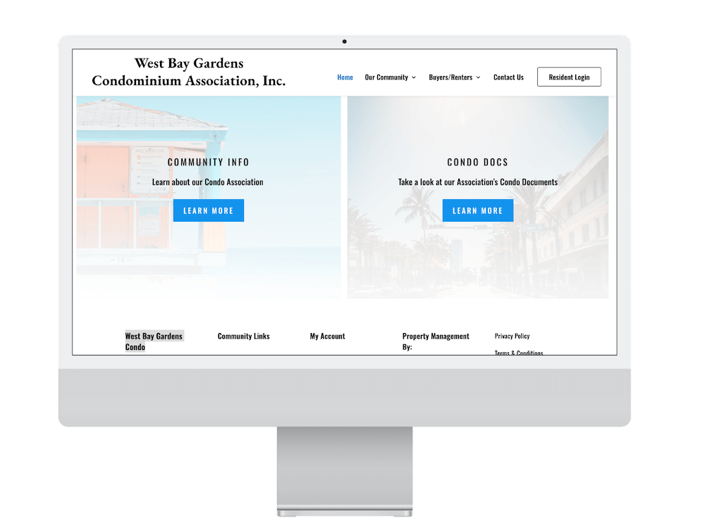
Designed for Residents, Owners, and Prospective Buyers
Condo websites often need to serve several audiences at once. The West Bay Gardens website provides dedicated areas for current residents, owners, renters, and prospective buyers, including community information, condominium documents, management information, and resident login access. This type of organization helps an association present important information publicly while keeping resident resources behind a secure portal. It is a good example of how PropertyPop structures a condo association website around the different ways people interact with a community.
Quail Run HOA Website – Severn, Maryland
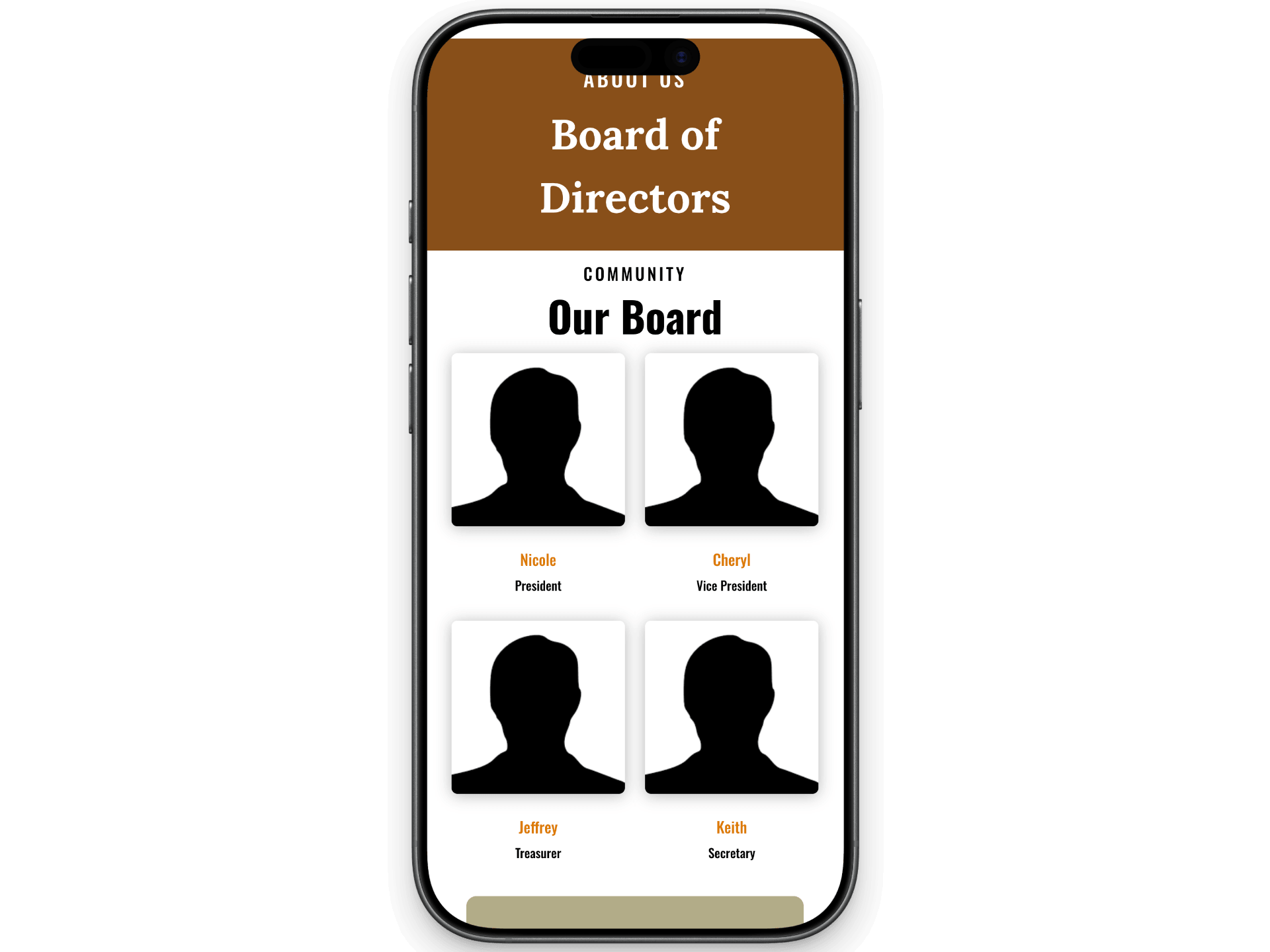
Clear Communication Between the Board and Residents
An effective HOA website should make it easy for residents to understand what is happening in their community. The Quail Run website places current announcements and upcoming events prominently on the homepage, while providing dedicated access to the Board of Directors, community information, and the resident portal. This creates a central communication hub where homeowners can quickly find community updates instead of relying solely on emails, printed notices, or individual communication with Board members.
Ville De Marco Condominium Website – Marco Island, Florida
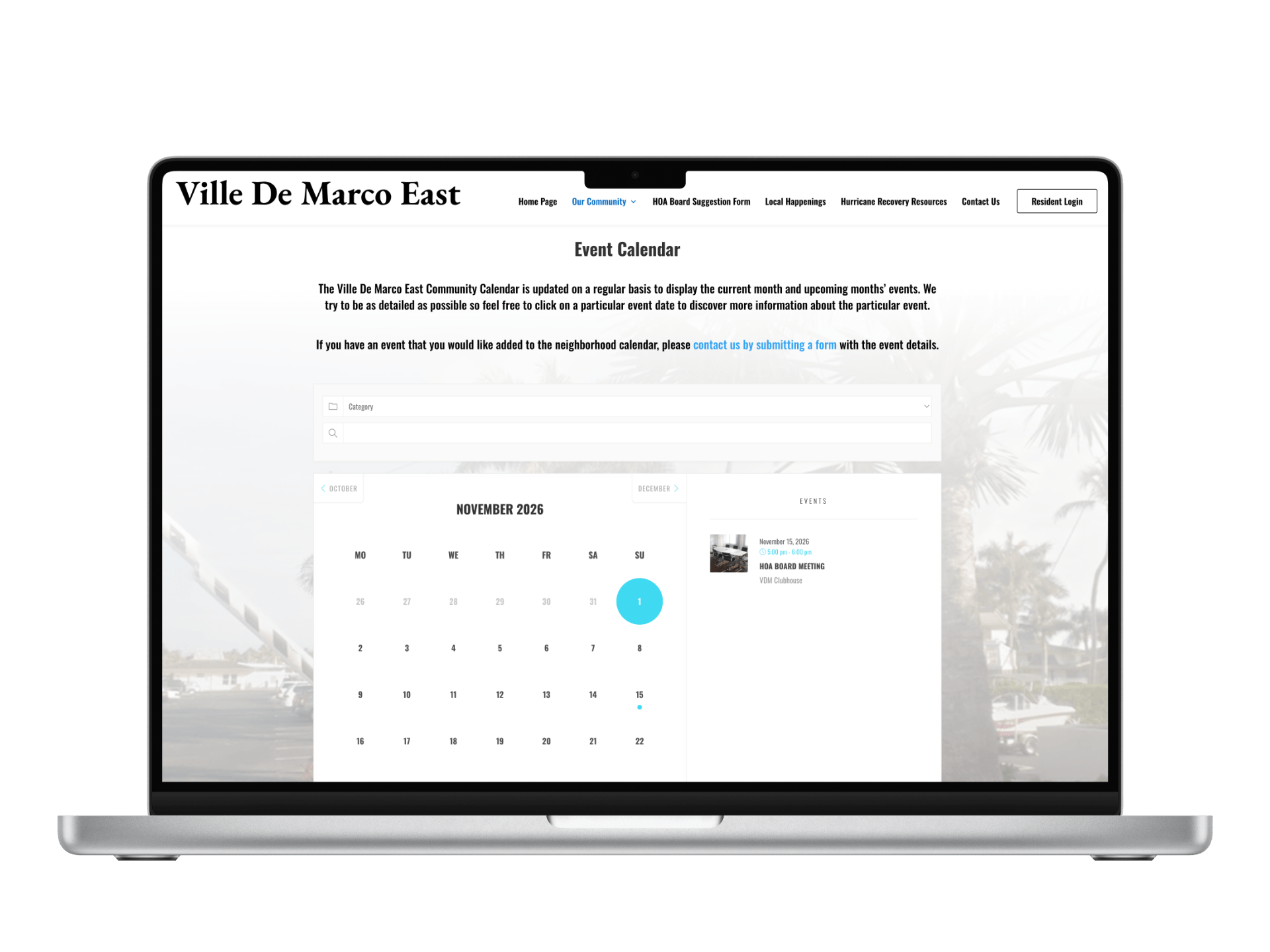
A Community Calendar Residents Can Actually Use
A condo calendar is one of the most practical features an HOA or condo website can offer, but its usefulness depends on how easily residents can find and understand upcoming events. This community uses the calendar for Board meetings, social events, and important association dates. For residents, that means less searching through emails and notices to determine what is happening in the community.
Alii Kai Resort Community Website – Kauai, Hawaii
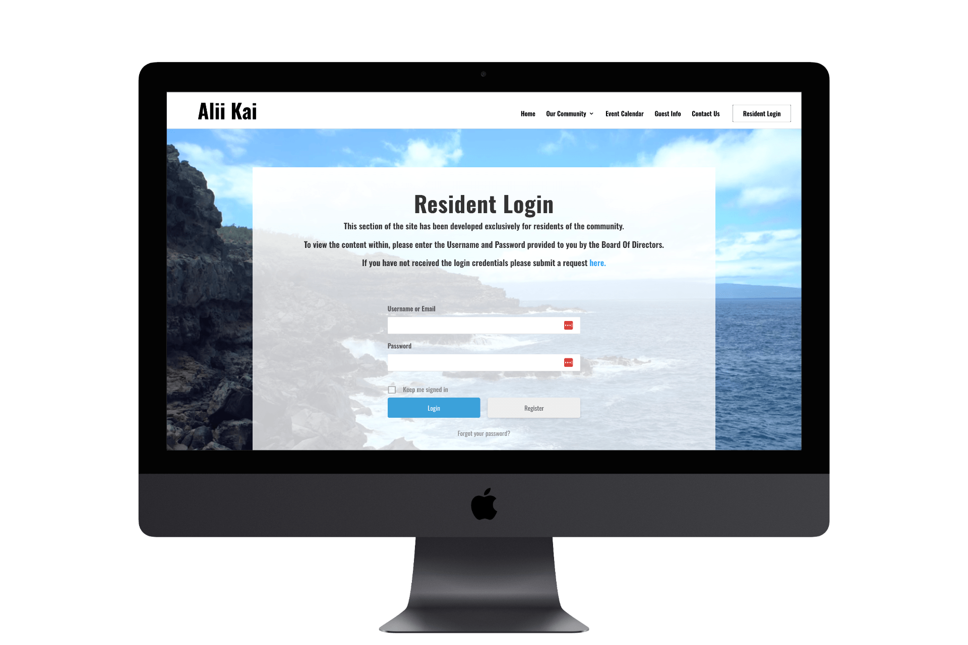
Secure Access for a Resort-Style Community
Resort communities can have more complex website requirements than traditional residential HOAs. Owners, residents, guests, and other visitors may all need access to different types of information. The Alii Kai website demonstrates how PropertyPop can combine a public-facing community website with secure resident access, allowing the association to showcase the community while protecting information intended only for authorized members. This type of flexible access structure is particularly useful for condominium, resort, and vacation-oriented communities.
Searching for a Community Website for your Association?
Hidden Springs HOA Website – Salado, Texas
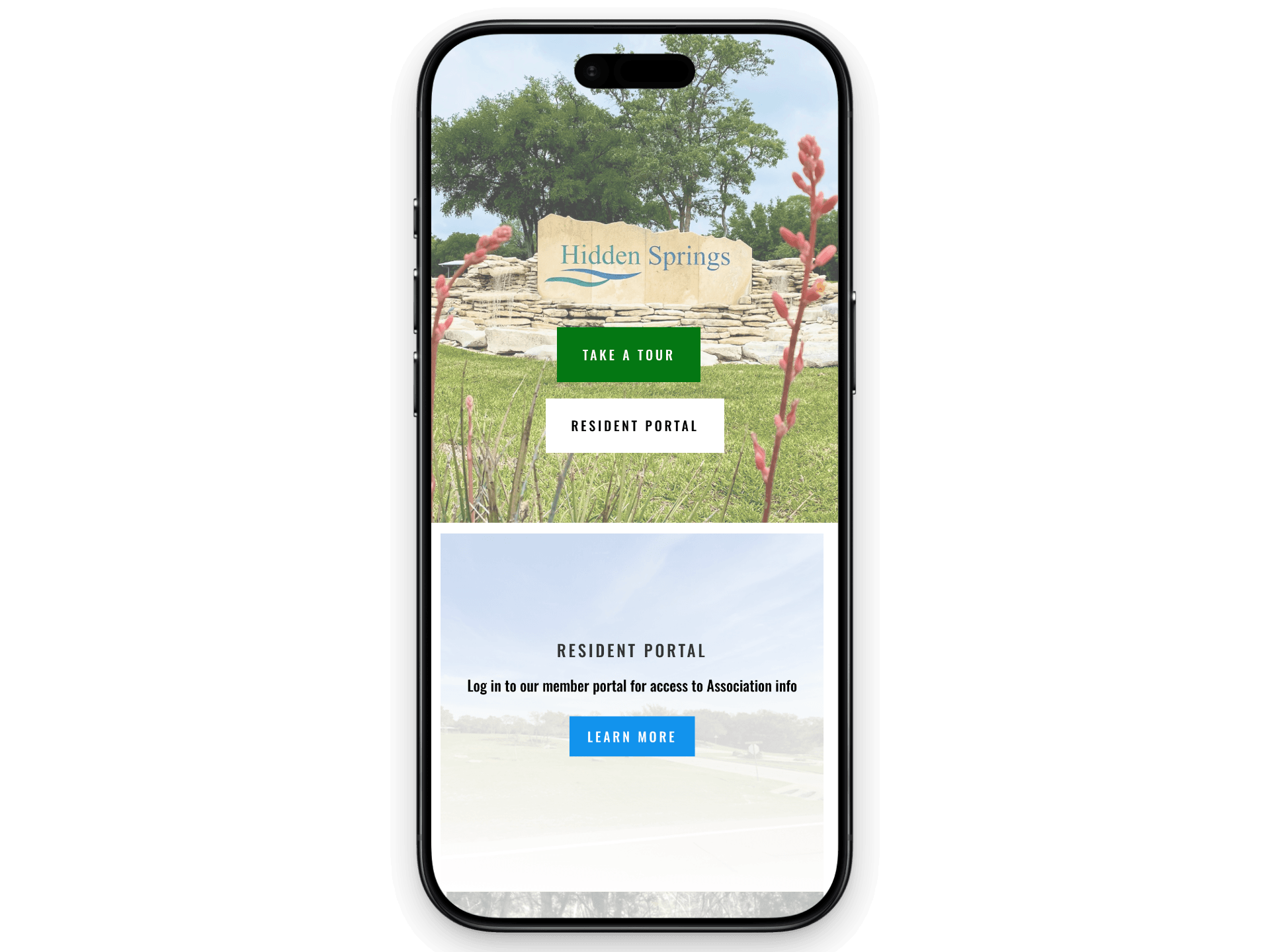
Simple, Intuitive Resident Portal
The resident portal is often one of the most important parts of an HOA website, which is why the login experience should be simple. Hidden Springs demonstrates a straightforward approach that makes it easy for homeowners to access the private side of their community website without unnecessary distractions. The resident portal houses governing documents and forms. Once logged in, residents can access the information and resources made available by their association. A well-organized resident portal can reduce confusion and make an HOA website much more useful for everyday homeowners.
The Four Seasons Community Website – Lakewood, New Jersey
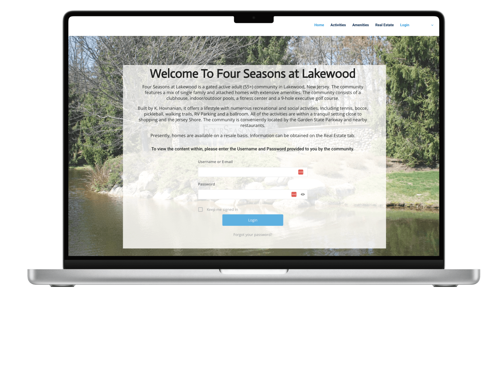
Private Access for a Larger Community
Larger homeowner associations can have significantly more residents, information, and administrative activity to manage. The Four Seasons website demonstrates how a community website can provide a dedicated private access point for residents while keeping the public-facing portion of the site organized and easy to navigate. The site separates public information from resident-only resources. For larger associations, a clear resident login experience is particularly important because even small points of confusion can translate into a large number of support requests for Board members and property managers.
One Ford Road HOA Website – Newport Beach, California
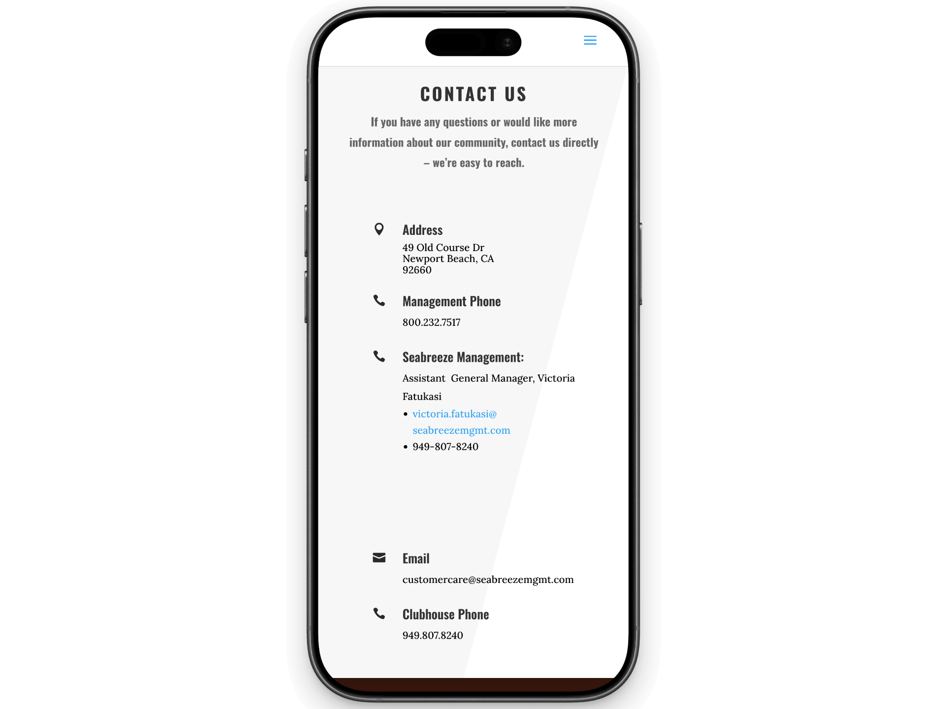
Making It Easy to Contact the Right Person
Community websites frequently receive questions that need to reach different people or departments. The One Ford Road website demonstrates how an HOA can provide clear pathways for contacting management, the Board, or other areas of the association rather than forcing residents to search for the appropriate contact information. Thoughtful contact organization is a small but important part of HOA website design because it helps residents get their questions to the right place and can reduce unnecessary back-and-forth for Board members and management. The site is designed for residents to access it from their mobile devices.
Maroon Creek Station Condo – Aspen, Colorado
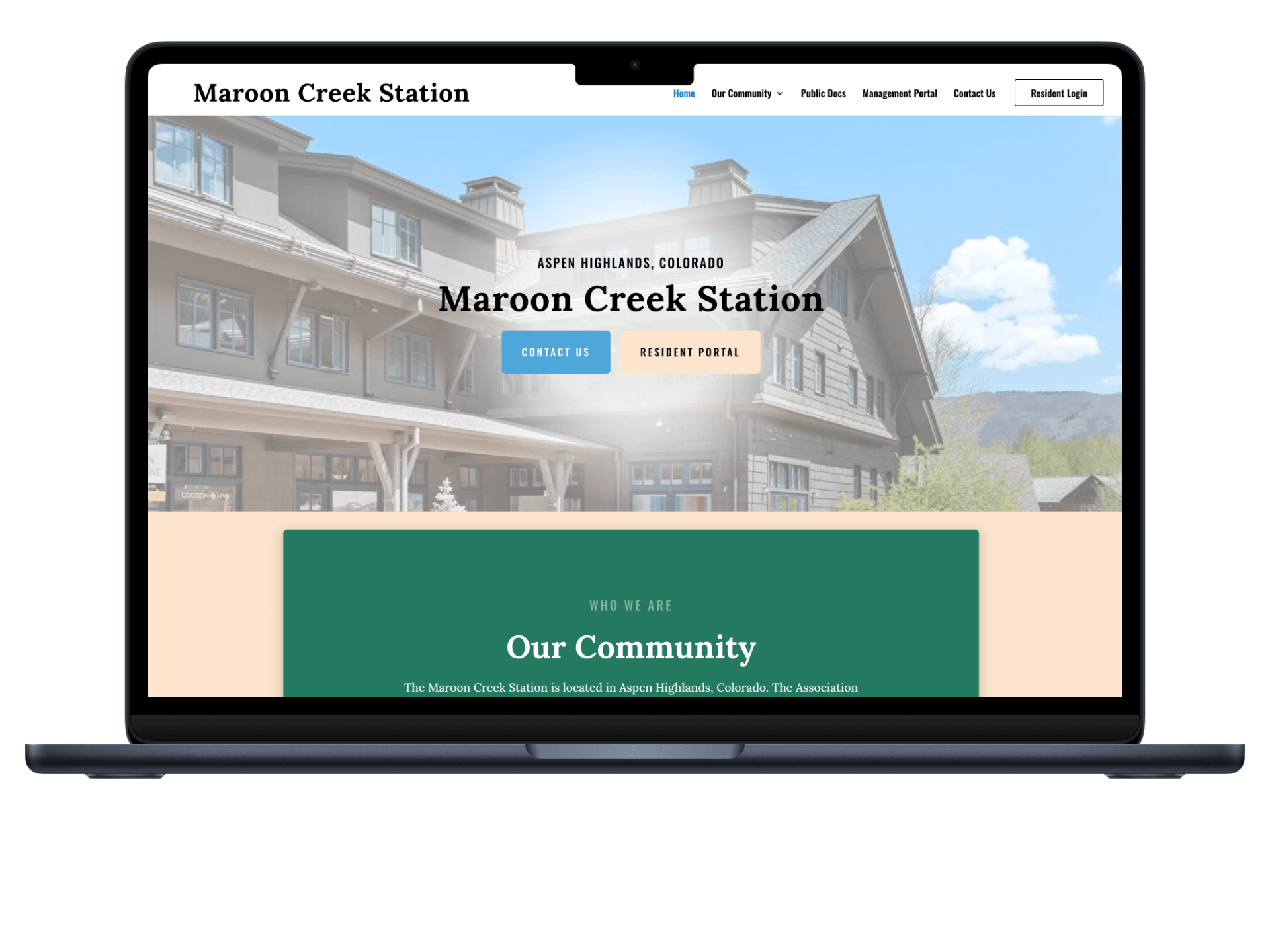
Organizing Detailed Association Information
Some condominium associations have significantly more information to communicate than others. Maroon Creek Station demonstrates how a condo association website can provide a dedicated space for detailed information about the Association while keeping everyday resources accessible through the site’s primary navigation. This type of content organization is particularly valuable for communities with extensive governing information, seasonal considerations, ownership resources, and other details that residents may need to reference throughout the year.
Seven Bridges Lifestyle Community HOA Website – Boca Raton, Florida
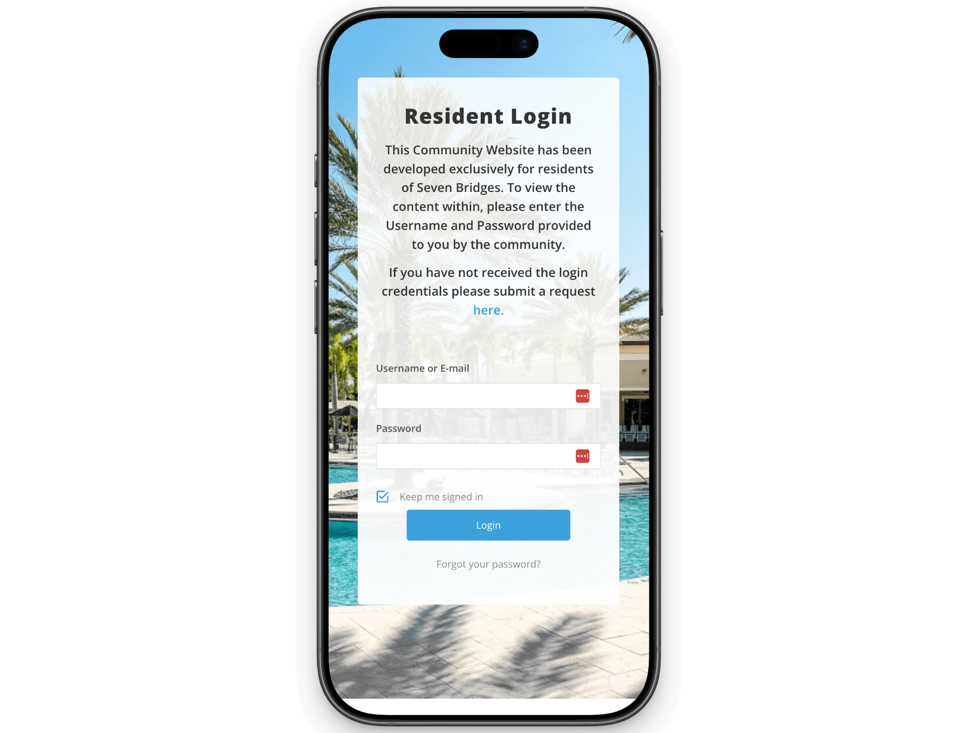
Homepage Imagery & Identity
For an amenity-heavy community, the homepage often does marketing work alongside its functional job — real photography of the clubhouse and pool communicates lifestyle in a way text can’t for prospective buyers browsing the community. The balance is making sure that imagery doesn’t crowd out the functional entry points, like login and notices, that current residents need on the same page.
Valencia Grand HOA Website – Boynton Beach, Florida
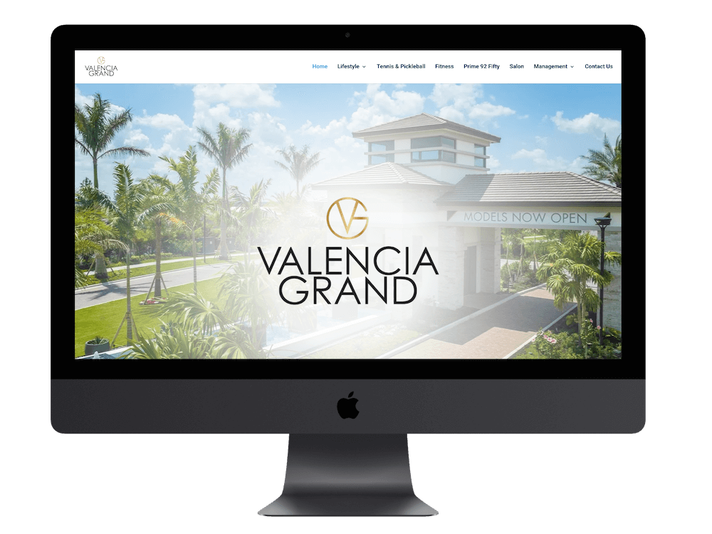
An HOA website should feel like it belongs to the community it represents. The Valencia Grand website uses real community imagery and association-specific content to establish a recognizable identity rather than presenting residents with a generic website experience. This is an important distinction in community association website design: the website needs to function as a practical communication platform while also giving homeowners and prospective residents a genuine sense of the neighborhood, its amenities, and its identity.
The Kensington Homeowners Association Website – Parkland, Florida
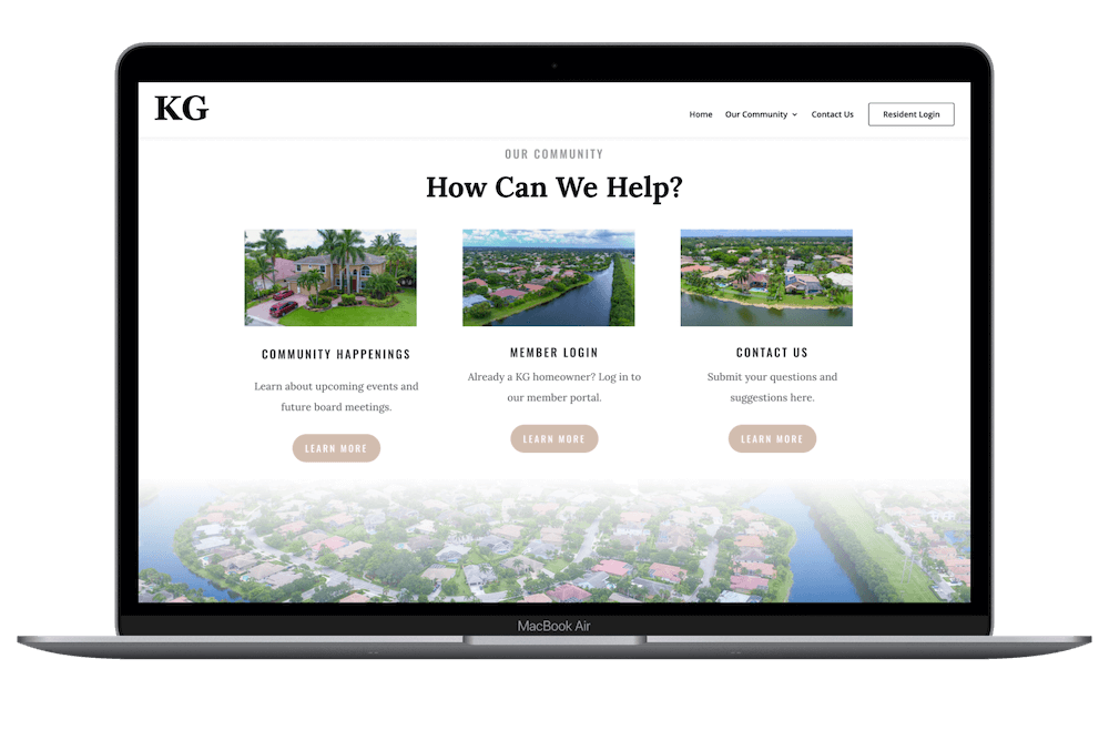
A Central Hub for Everyday Tasks
The Kensington website demonstrates a more centralized approach, giving residents convenient access to commonly used resources and information without requiring them to navigate through numerous layers of menus. This type of intuitive organization is especially valuable for homeowners who may only visit their HOA website occasionally and simply want to find a document, announcement, event, or contact quickly.
What Makes a Great HOA or Condo Website?
A community website should do more than look good. It should make life easier for residents, Board members, and property managers by putting important information and everyday resources in one convenient place. When evaluating an HOA or condo association website, here are some things we believe are worth looking for.
✓ Easy, Intuitive Navigation
Residents shouldn’t have to hunt through multiple menus to find a meeting notice, community document, contact information, or upcoming event. The most important resources should be easy to find from the moment someone arrives on the website.
✓ Effective Community Communication
A website should make it easier for an association to communicate with its residents. Announcements, news, newsletters, alerts, and other updates can give homeowners a central place to stay informed rather than relying exclusively on emails, printed notices, or scattered communication channels.
✓ Helpful Tools, Not Just Information
The best community websites aren’t simply digital bulletin boards. Depending on the association’s needs, a website can provide access to online forms, amenity reservations, payment resources, document libraries, directories, maintenance requests, and other tools that residents actually use.
The Bottom Line
The best community website isn’t necessarily the one with the most features. It’s the one that makes the right information and tools easy to access for the people who use it.
That’s the philosophy behind the PropertyPop Community Website platform. We build HOA and Condo websites around the everyday needs of residents and the associations that serve them—combining professional design with practical tools, intuitive navigation, secure resident resources, and ongoing support.
Boost Community Value
Find out how an Association Website can improve your community value and increase homeowner satisfaction.
PropertyPop
PropertyPop develops modern, professional HOA and condo websites that represent your community, improve communication, and give owners easy access to secure resident resources 24/7.